
The “Official” Speakeasy of Cesarzville
We utilized our open floor plan living room, kitchen and breakfast room to create the Mockingbird Lounge. We wanted it to feel like it was an unfinished or reclaimed building that included some minor touches to make it seem like “someone” was trying to add a little class to the place. We gathered some inspiration from restaurants and buildings in downtown McKinney where exposed brick and beams remind you that you are in an older building. Additionally, we drew ideas directly from scenes in The Untouchables and Peaky Blinders. Finally, we wanted to include nods to history where we could.

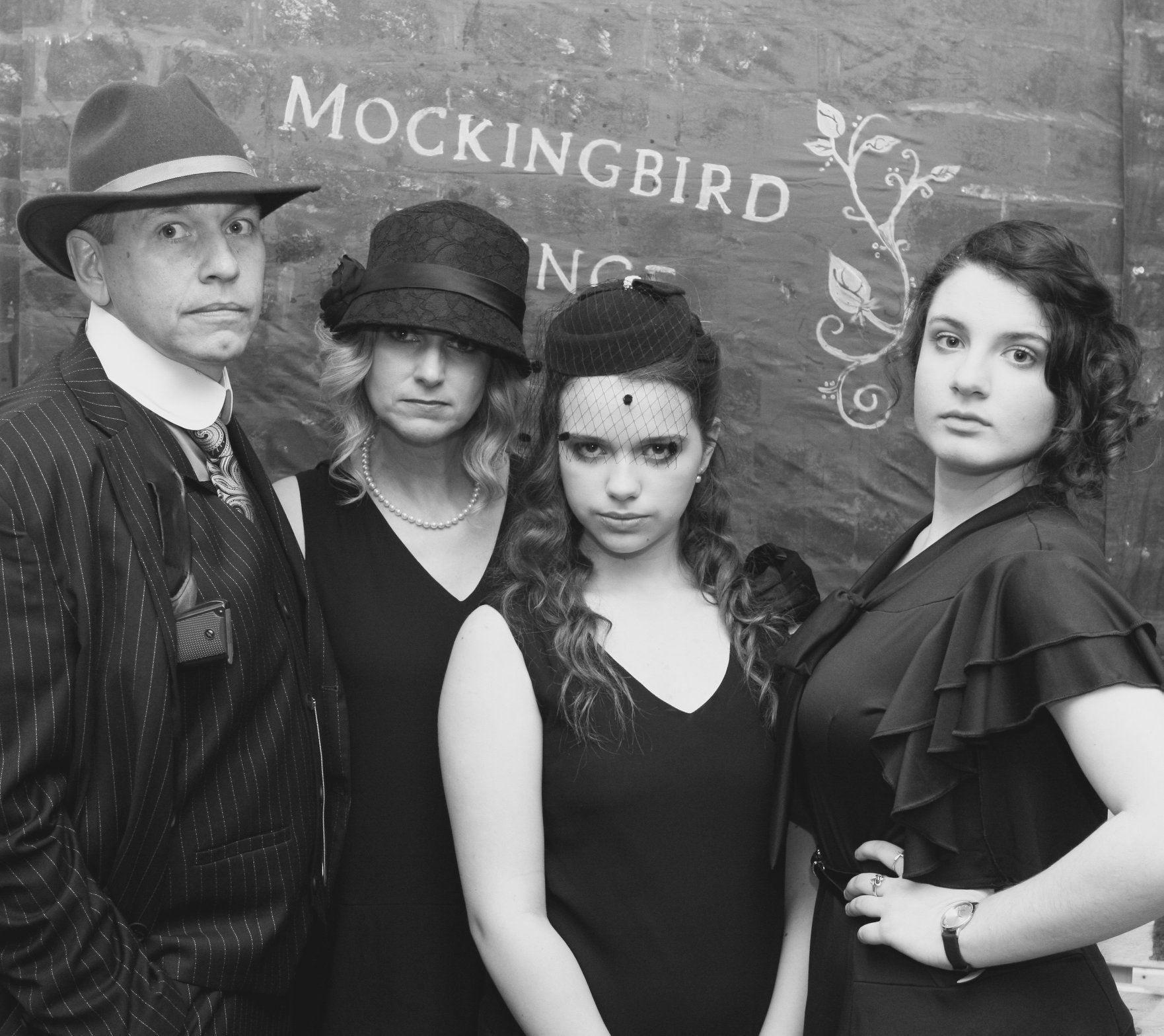
Our first challenge was to create a picture backdrop that fit the party theme, blended into the decor, and didn’t give off a cheesy “twenties party” vibe. We decided that an exposed brick wall with the Mockingbird Lounge logo was the way to go. In order to make this idea blend with the rest of the party it needed to begin and end naturally in the space which turned out to be 8 feet long and run from the ceiling to the floor. To accomplish this we enlisted our eldest, to hand paint bricks on two brown king-sized sheets, sewing them together and attaching more to the bottom (as a side note once this was pinned in place access to the Master bedroom was cut off). We added wooden crates with Death and Vodka and 2020 in case anyone mixed this party up with another.

Our next challenge was to transform our rather blase suburban fireplace into something that with personality that took on that reclaimed feel. We covered the tile with removable brick wall paper that was as similar in color as we could get to the picture backdrop. Alex built a rough pine cover that sat on top of the mantel, and we changed out the slightly more modern decor with a plant and some extra candles.

Since we’re on the subject of brick wall paper, we used a TON of it! First, we wrapped the bottom of the kitchen island that faces into the living room with it. (This wasn’t originally part of the plan, but my vision for building a wood facade was vetoed.) Adding the brick increased the perception that the entire space was connected and helped bring everything together.

We also papered the small path that connects the dining room to the kitchen. This helped create the alley look and feel from The Untouchables. In addition to the brick we added vinyl signage for Employees Only and Apartment Numbers to the pantry and laundry room doors. This was also the last space that we used a yellow light bulb. I wanted to add some crates and pallets to the space, but it’s a pretty narrow space and we were afraid it might be hazardous.

I’ll admit the cost of the brick wallpaper can add up, it took a lot more to cover these spaces then we originally planned. I think you can get the same concept especially in places like the alley way and the bar, by placing oddly shaped pieces torn pieces on the walls. It gives you more of an exposed brick under the plaster look. We really saw this as we were pulling the paper off the walls, and remnants of it remained.
Another key design element we relied on was bottles and wooden crates. Alex made over a dozen wooden crates that we stacked and scattered throughout the party space. In addition to the “Death & Vodka” crate, we stencilled things like “automotive antifreeze”, “embalming fluid” and “sacramental wine”. We filled the crates with wine and liquor bottles that we collected for months from friends and neighbors (We even lucked into someone on the neighborhood Facebook page giving away some pretty funky whiskey bottles… yes PLEASE). To make sure we avoided modern labels, we steamed and scraped the original labels off of most of the bottles. We created new labels and glued them to bottles that showed in crates.

We tried to add some authentic art to the decor as well. We learned from our research that prior to prohibition brewing companies would help finance and provide general decor to bar owners as long as they only sold that brewing company’s products. (I’m totally thinking cola wars at this point.) As a result, a large number of bars had similar if not identical decor. Anheuser-Busch provided its establishments with posters of Custer’s Last Stand. Thankfully, Amazon sells reprints of these so we ordered one and replaced a cute “girls at the beach” picture with it for the party. As a result of Carrie Nation’s bar bashing escapades, most bars also had an All Nations Welcome except Carrie ax or sign. Some of these were incredibly intricate. We stuck with the saying on wood, but we did add a real ax. We also added liquor advertisements that predated prohibition to our frames above and below the Carrie Nation sign. Finally, we painted the Mockingbird Lounge Logo onto a stained piece of plywood. I’m really not sure how accurate it would be, but seemed like a way the sort of thing a quick pop-up bar might put together.

For various parties we have rearranged and removed furniture, but we have always left the couch. It takes up a lot of space, and really doesn’t provide a ton of seating. For this party in particular it really would have taken away from the vibe. We moved the couch out and brought in 5 standing tables. These were the perfect height for people to stand, chat and have a place to put down their food and drink. (Honestly, these were one of our all time best party investments. I imagine we will be using them for years to come.)
We covered them with white square tablecloths. For the centerpieces we added small amber bottles with more embalming liquid labels as vases, with a single red carnation in each. (A small Callback to Boardwalk Empire).

Knowing it probably wouldn’t last long, our original idea had been to use the kitchen and island as a bar with our college daughter and her friend tending the bar. We rebottled liquor with labels that looked a little more bootlegged and a little less professional. We added signage with drinks the girls knew how to make. The space looked great as a bar, but it was quickly overrun with faster drink makers and people looking for a space to gather.

There were a few other minor details that I’m not sure anyone necessarily thought about but added to the overall atmosphere and experience. First, we changed out all of the light bulbs. While we wanted the funeral home to feel dark and a little eerie; we wanted the Mockingbird Lounge to seem hazy and just not bright. We found that soft pink light bulbs cast a pleasant light but aren’t harsh and bright (bonus they’re supposed to make you look prettier). Using the two different shades of bulbs helped draw a distinction between the two areas.

Finding fringed lampshades was a lot more difficult and expensive than I thought it was going to be. We almost just left it alone, but fringed lamps really seemed to be a major way set creators let you know it was the twenties. We bought some cheap fringe at the craft store, and hot glued it to the inside of our existing lampshades. After the party, it pulled right off.

Lastly, we changed out the pictures in our house. We have two pictures of the girls that are next to the bathroom. We switched those out for black and white portraits of family members that were taken prior to the 1920s. In the bathrooms we added advertisements for some interesting beauty products from that time including a Chin Reducer and Beautifier.

For a party with a theme like this one where anyone can just run down to Party City or order massive backdrops and props from Shindigz, I think it’s important to try to find a way to make your party stand out and make your guests feel special and that it was worth their time to show up (after all there are other parties to attend and plenty of Netflix to watch). I also really feel like the devil is in the details, it’s those little things that can really make your party pop. With this party, I thought we hit them all decor wise. I was quite happy to pat myself on the back… until I saw the microwave in the pictures. It’s a small reminder that no matter how great it was, there is always something you can do a little better or different next time.

Pingback: Death & Vodka – With Love